

SAVR
To provide a solution to simplify the complicated recipes for at-home chefs on the SAVR RECIPES app.
GV Design Sprint / Mobile UI/UX Design
I created a better cooking experience for new chefs
MY ROLE
Product Designer and researcher
TIME LINE
5 DAYS GV SPRINT
LOOK AT THE END
In six months time
Users: Have a stress free cooking experience with better end products using SAVR recipes
Business: Improved customer ratings, a significant increase in the number of users
CONSTRAINTS
Project details and users ressearch were provided by Bitesize UX
TOOLS

SAVR

A storehouse of hundreds of recipes for at-home chefs!
PROBLEM
At-home chefs use SAVR recipes for an enjoyable cooking experience but while cooking complicated dishes they end up mostly with chaotic, stressful processes, and unexpected end products.

WHAT MIGHT GO WRONG
It is realistic for a designer to know the worst-case scenario. I wore my pessimistic hat and thought these things could go wrong:
Would customers dislike the new layout of the recipe presentation?
Would many subscribers quit using the app?
Are we adding more frustration and chaos in the process?
Could the app's rating go lower?
HOW IT WORKS
On SAVR, a chef can select the dish by looking at the dish's rating, difficulty, time, and category.
To make the cooking experience fun, the chef will finish prep tasks before starting cooking.
Chefs can add ingredients directly from the app to the shopping list to avoid confusion.
The number of servings can update the dish.
A separate utensil list makes the chef prepare beforehand.
GV SPRINT PROCESS

DAY ONE
Research
In order to gain a better understanding of users’ problems, I synthesized the information from the user interviews and highlights from user research. These interviews were previously conducted and recorded by SAVR. When interviewees were asked to describe their experience cooking a new dish, they highlighted time, unordered steps, and unknown techniques as their biggest hurdles.
In the recorded conversation I noticed that she likes to try new recipes because it helps her learn to cook a specific dish. However, when she tried a complicated recipe she could not keep up with time, had a chaotic experience, and a ruined dish.
Here is the summary of my findings from the research.
QUOTES
Easier if steps were laid out in the way if you can do this while waiting for the meat to cook. Prep this beforehand...
There are some parts I don't enjoy though...like emptying the cabinets because I don’t know what kitchenware I need
But a lot of time I see techniques that I am totally unclear on. I google images search…..which kind of throws everything off...
I really liked when recipes are true to the time
Constantly needing to wash my hands so I can refer back to the phone
I try to be as efficient as possible with how many pots and pans I’m using...
I like to be as prepared as I possibly can be before I start cooking things.
FINDINGS
PREP WORK

The chaotic and stressful process as prep steps were not listed in the recipe
COOKING TIME

Time constraint because expect to finish cooking in the mentioned time
EQUIPMENT

Knowing equipment before cooking will help
PRINTED RECIPE

Having more options than just the phone to see recipes
PREP WORK
TECHNIQUES


Thorough prep options
Techniques and definitions should be embedded in the recipe
Persona
Nick is an enthusiastic chef who likes to cook occasionally. He follows SAVR recipe step by step and expects to get a desired end dish. I kept his persona in my perspective as I moved to the next step.

Brain storming
After analyzing data from the research from the SAVR users I wrote down all the ideas on post-it notes. I made below affinity maps to understand the problem.
I realized categorizing my insights into three stages of cooking can help me to design a better product. Before and after cooking experiences are an essential part of a great overall experience.
before cooking
while cooking
after cooking
BEFORE COOKING
Substitute options
Check ingedients
Detail prep list and time
Tips to keep phone on
List of appliances and utensils
WHILE COOKING
Feel rushed
Step Check
Visual Instruction
One click access to techniques and definitions
Check for small mistakes
Time used wisely
AFTER COOKING
Satisfactory end product
True time check
Encourage to rate and recommend
Plating and serving
How Might We
The next step was to visualize users cooking a hassle-free dish on the app. I listed some user stories to articulate the functional needs and requirements for completing the task successfully. Also, I sorted them out into different categories to find the most interesting and useful questions. I used this information to write HMW problems.
How might we......
PREP
PROCESS
get ready to start hassle-free cooking?
have true prep and cooking time information?
know if this is the right level of the recipe for me?
get ready to start hassle-free cooking?
have true prep and cooking time information?
know if this is the right level of the recipe for me?
use time between the steps efficiently?
check while cooking that I am not committing any mistakes?
not feel rushed while preparing food?
learn new techniques and definitions without leaving the app?
RESULTS
provide my feedback about the overall experience?
make our end product more appetizing and appealing?
User Flow
The next step was to visualize users cooking a hassle-free dish on the app. I listed some user stories to articulate the functional needs and requirements for completing the task successfully. Also, I sorted them out into different categories to find the most interesting and useful questions.

DAY TWO
Lightning Demo
I looked at the competing recipe apps to see how they solved similar problems. What UI elements and components have they added in their apps to simplify the recipe?

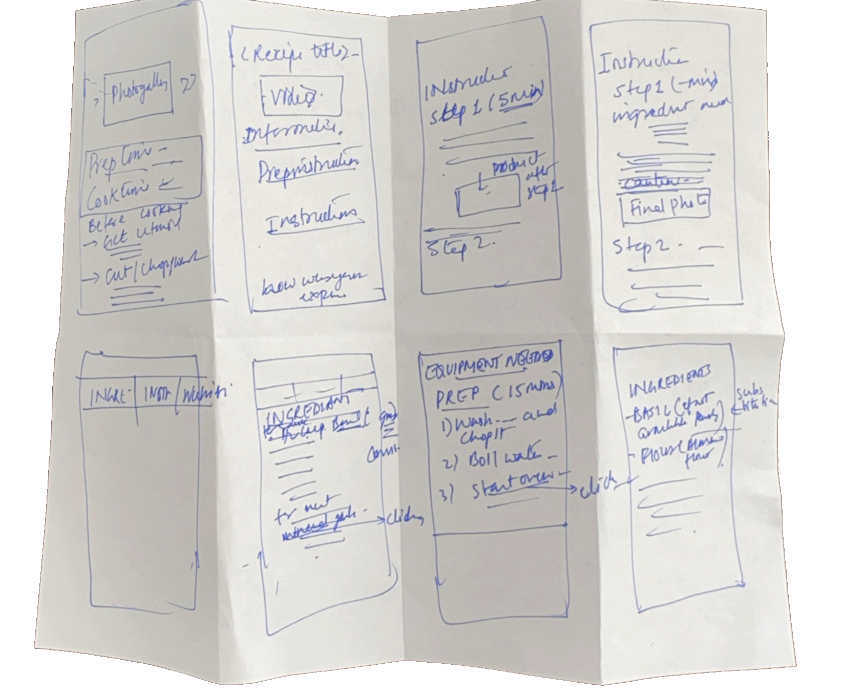
8 Crazy Sketches
I gathered all the information from the last two days and drew eight designs on a piece of paper. I spent eight minutes drawing them all. Sketching the solutions is a great way to move from abstract to concrete ideas.
DAY THREE
User Storyboard
Now I have ideas for solutions and sketches. I drew the user storyboard, which is blueprints of the prototype. It helped me to understand how the user will navigate different tasks to achieve the final product. It also helped me design the sequence of the screens.

DAY FOUR
Wireframes
Finally, it's time to create a realistic prototype by combining all the sketches, ideas, and solutions, which can be tested with customers. I designed the below high-fidelity wireframes with a design mindset on Figma.
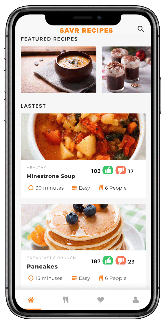
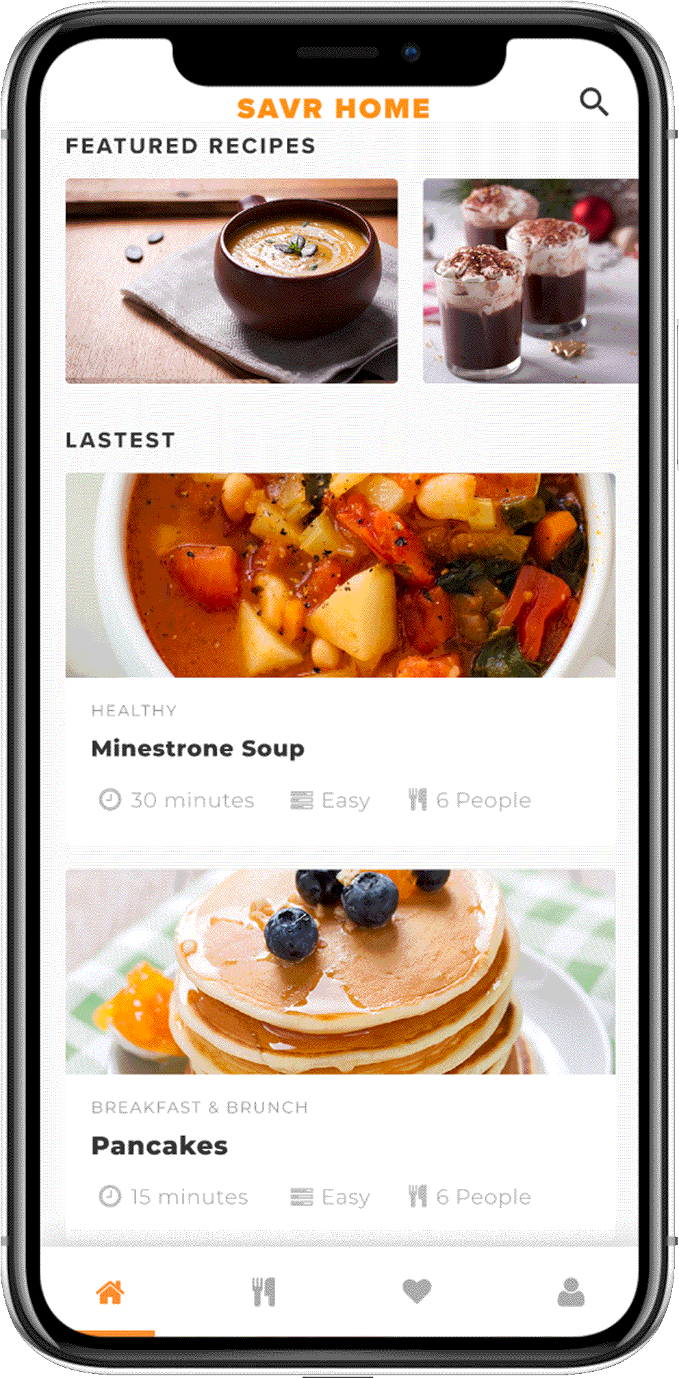
LANDING PAGE
I want to provide users a personalized landing page where they can access the latest and favorite recipes. Users can browse for a recipe to cook based on the level, category, cuisine, and time of the dish.
RECIPE PAGE
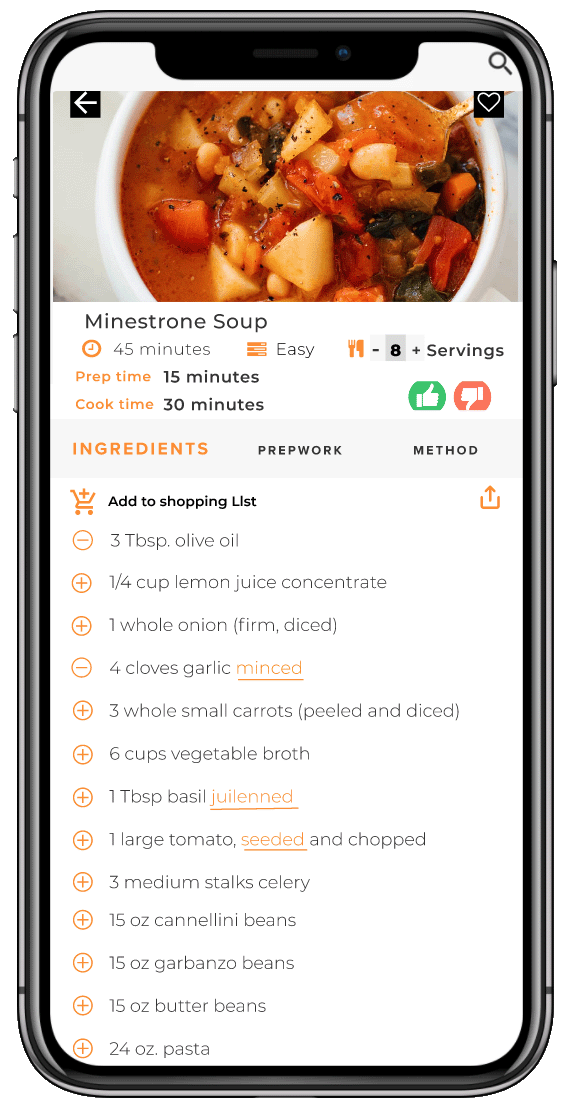
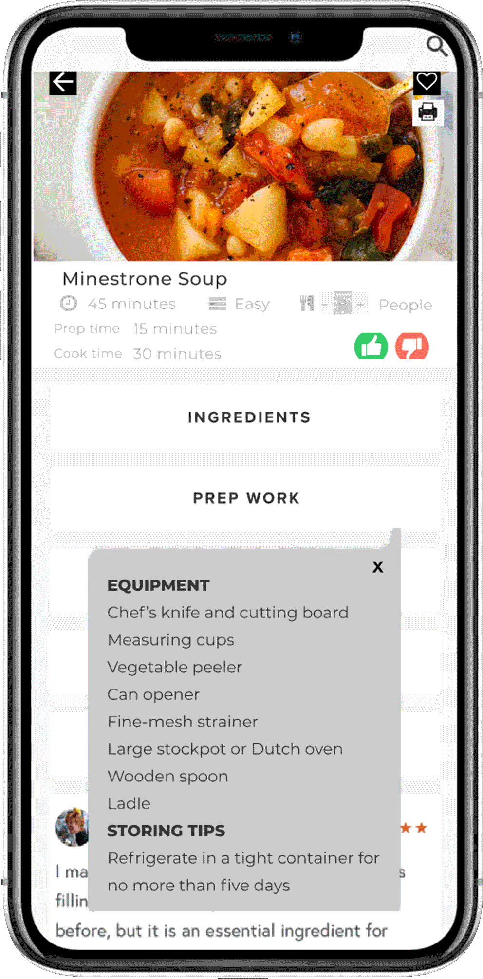
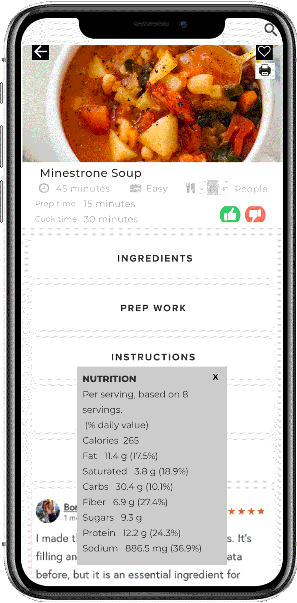
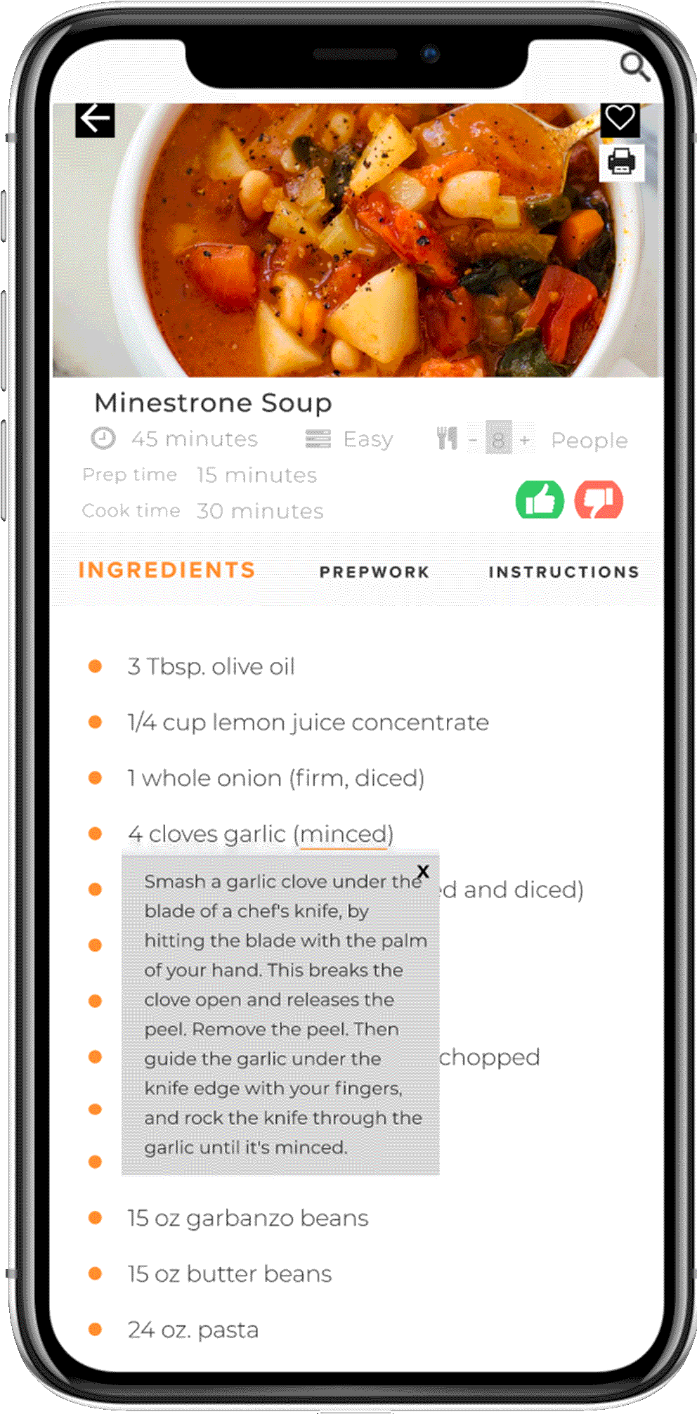
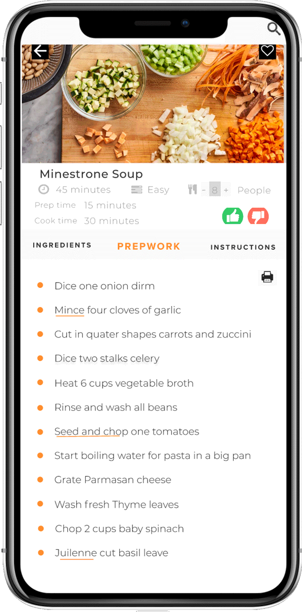
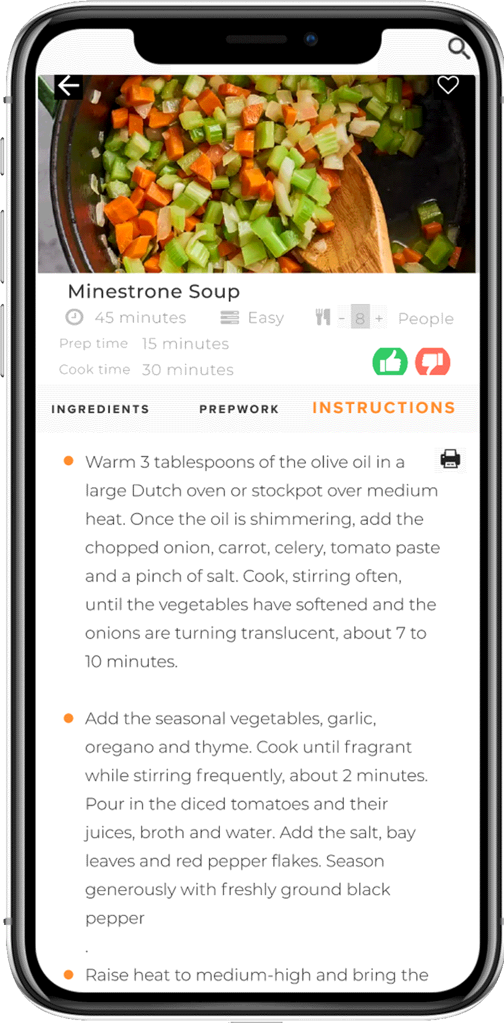
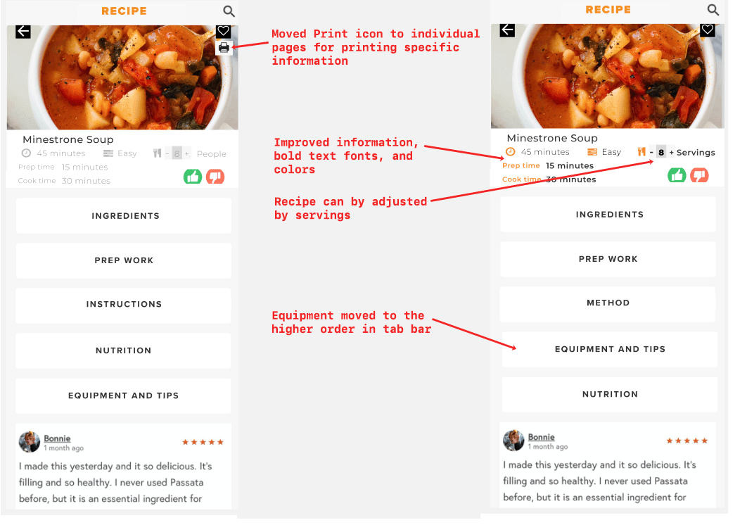
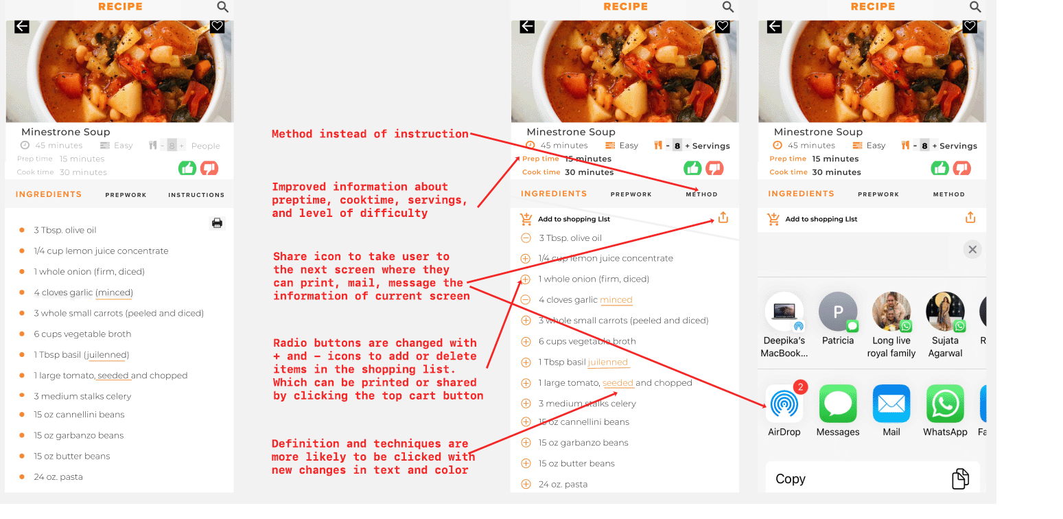
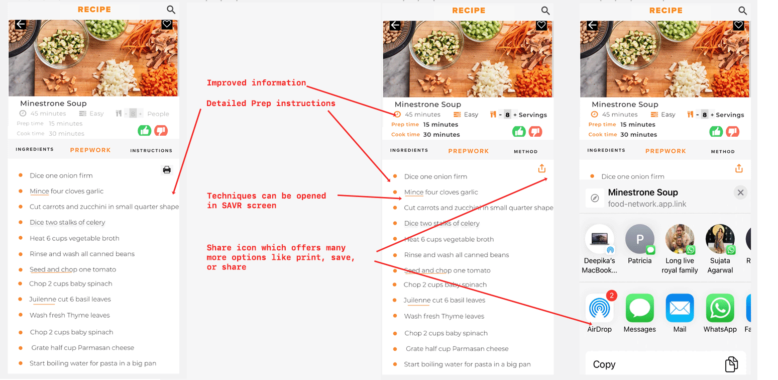
Next, my purpose is to display the recipe details in an easy to follow user-friendly way. I added some important information like prep time, cook time, level of difficulty, and adjustable serving sizes on the top menu. Chef can print and add the recipe in favorite for future use. Further, to have clear next steps, I divided the whole recipe into five sections: Ingredients, Prep work, Instructions, Nutrition, and Equipment
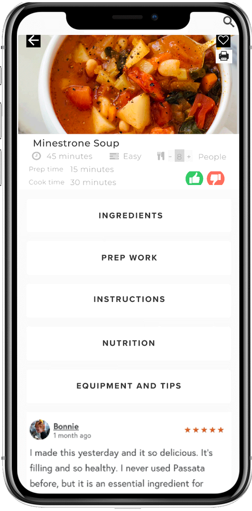
BEFORE COOKING
I figured out that having a list of utensils and nutrition information before the process starts can be helpful.
WHILE COOKING
While cooking, users can follow three different steps. Firstly, they can gather all the ingredients and then follow the steps mentioned in prework to save last moment frustration and stress. This will also help users to manage their time effectively. They don't have to leave the page to learn new techniques and definitions. They can access this information just by clicking those terms in the recipe. Having solid prep work will lead to an enjoyable cooking experience.
DAY FIVE
Prototype
After designing high-fidelity screens, I wanted to test with five users to validate my ideas and test my designs' usability. I prototyped my wireframes and recruited five new chefs to test them on Zoom in a moderated setting.
Usability Testing
I have assigned different tasks to the five users and observed them performing these tasks. They were requested to think aloud to give me a better idea of their thought process.
TASKS
Participants were asked to follow the recipe to cook Minestrone on the SAVR app.
Do they notice the definitions embedded in the recipe?
Do they notice print and other buttons?
How easy was it to follow the steps of the recipe?
Did they notice an option to adjust the recipe for fewer people?
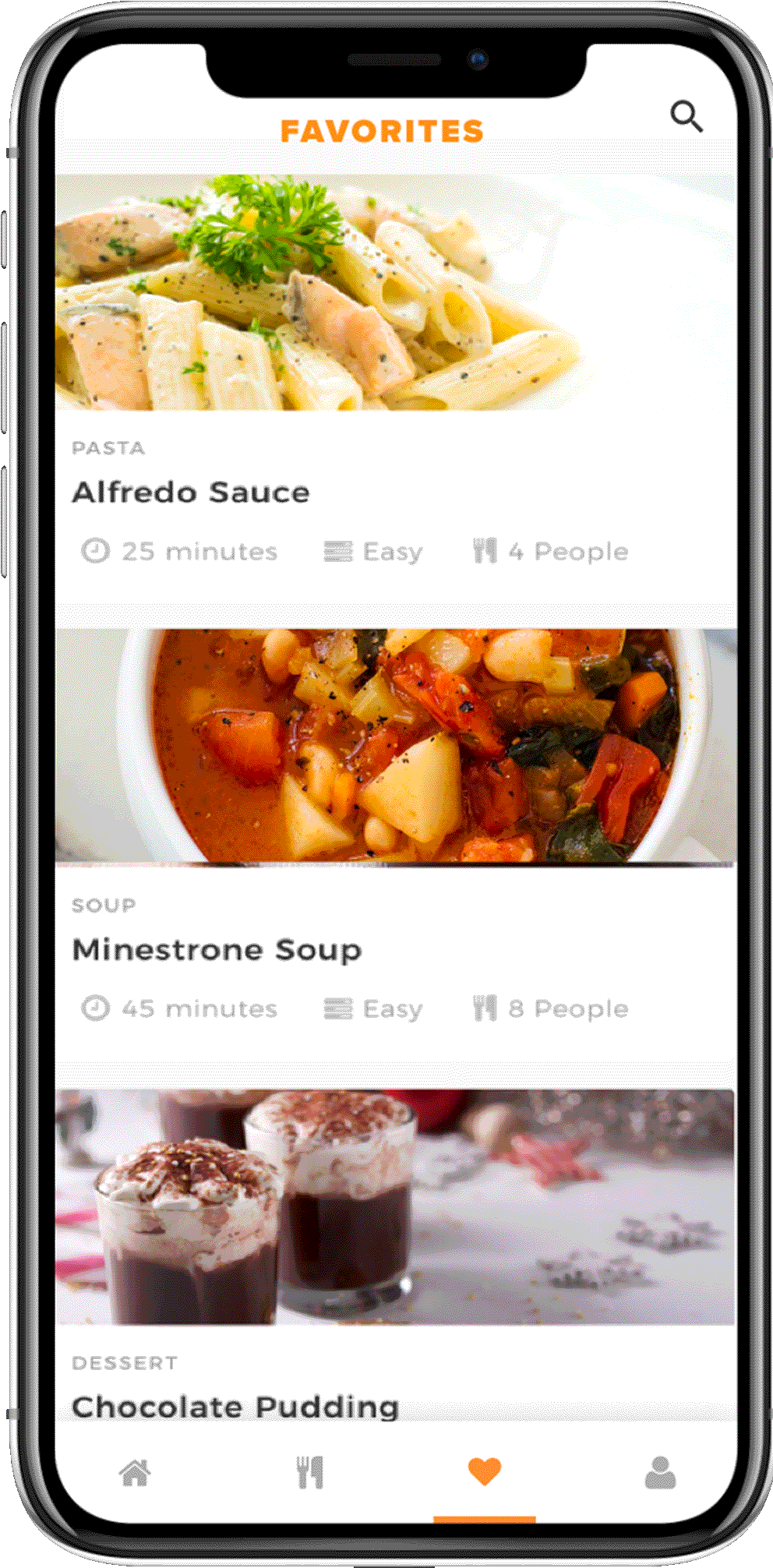
Did they notice the heart for saving it as a favorite?
They were asked to describe the following
How was the overall experience interacting on each page?
What did they like or dislike on each screen?
KEY TAKEAWAYS
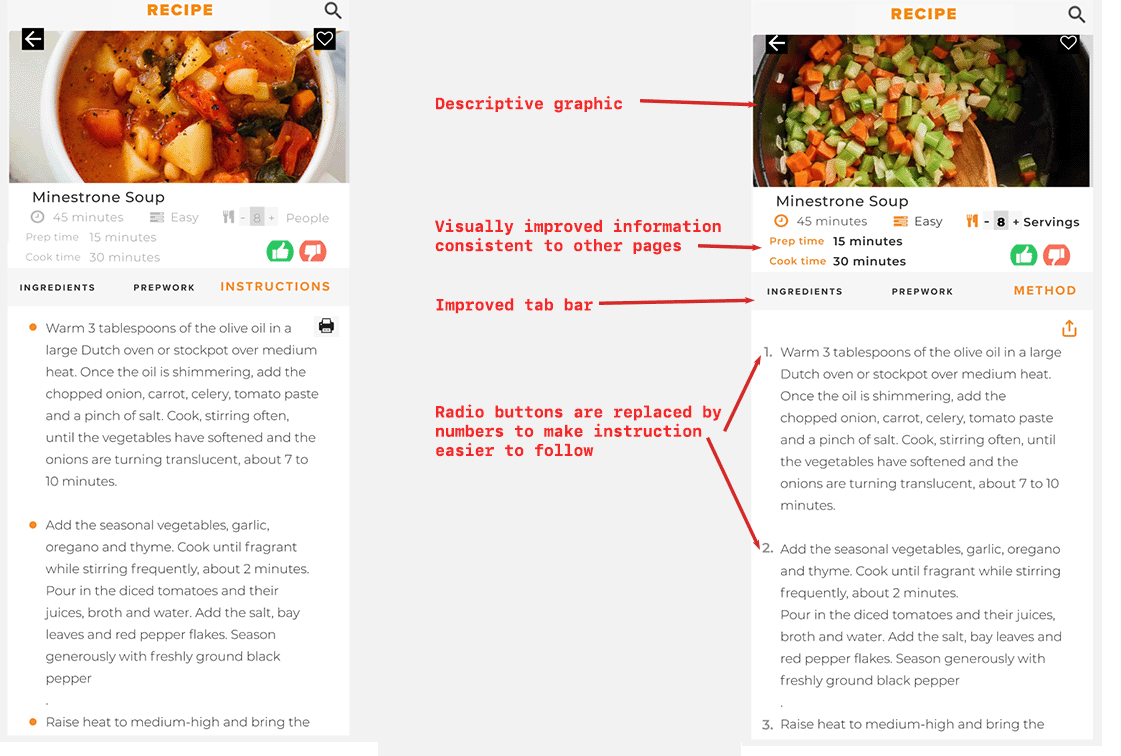
Most of the users liked the way the recipe is divided into different sections. They also found CTA buttons very intuitive and easy to use. Three users noticed the heart icon for favorite, four clicked on underlined words, and no one noticed the people button.
Users had difficultly keeping the track of steps in the recipes.
Change bullet points to numbered steps on the instructions page.
Users found headers confusing
Change Instruction heading to Method
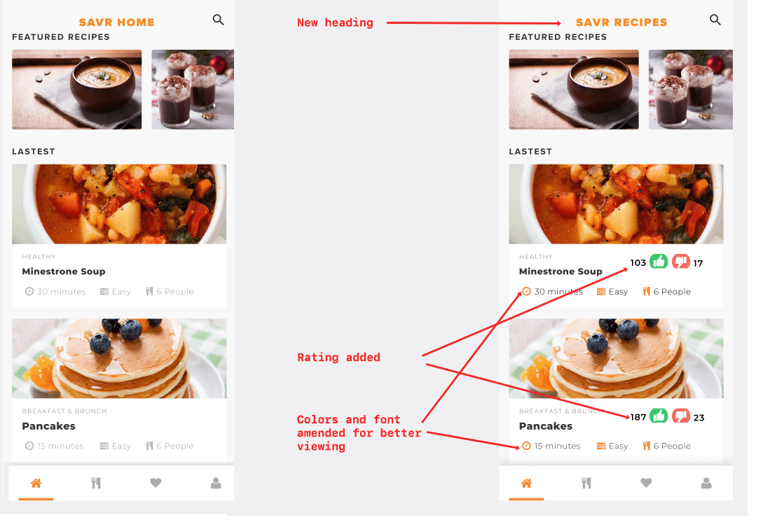
Change title from SAVR Home to SAVR RECIPES
Some users did not notice the information displayed on the top menu like servings
Make the font in some areas more visible
Change people wordings to servings for usability
Move Equipment higher in the menu
Some users prefer equipment to be known before the nutrition.
Buying ingredients sounded a lot of work to chefs
Add ingredients to the shopping list directly from the app
Divide ingredients into required and optional categories
Users were curious to know the author of the recipe
Mention the name of the author of the recipe
Users want to share recipes with friends; they also like to have printed copies for storing the recipes.
Add option to save or print on the Ingredient, Prework, and Method pages
Iterated Screens
The landing page is more visible and understandable after the above changes.
Adjusting the number of servings is a useful feature, and I made it more prominent.
Users can add ingredients directly to their shopping cart. I added a way to share and print recipes to add functionality.
I changed bullets points to the number of steps to help the user keep track of the current step.
I changed bullets points to the number of steps to help the user keep track of the current step
FINAL PROTOTYPE
NEXT STEPS
Explore the idea to incorporate videos or many more illustrations to show complex cooking techniques.
Explore the idea of displaying a step-by-step method of cooking by adding more pictures of end products.
Encourage users to leave feedback to keep track of progress
Add more filters at search options like easy, similar recipes, below 30 mins, less than five ingredients, more from the author, and other options.
MORE PROJECTS


